

Introduction
In recent months, the market has experienced substantial volatility, with notable price swings in both directions that often normalize within a matter of weeks. It appears that price momentum alone is not enough to tell if a true bull market is actually brewing and for us to claim that “we are so back” when we are in a very PvP market. To provide more color, we will take a look at another major indicator of bull markets; the influx of new capital.
As new money is injected into the market, it brings in new market participants who can help grow the pie. Retail and institutions alike can help increase overall market caps and can trigger a long-lasting uptrend by investing in the ecosystem. In other words, potential counterparties to ‘buy your bags’ into a bull market. But how can we track this new capital inflow, and predict if an upcoming bullish phase is sustainable?
This research report attempts to answer these questions by examining two key on-chain metrics, the market caps of the largest stablecoins and newly onboarded Ethereum users. While both provide insights into fresh money flowing into the market, stablecoin market caps include both institutional and retail money and don’t say a lot about the actual usage of the stablecoins. On the other hand, newly onboarded users, as defined in this report, are typically retail and also give insights about web3 adoption in general.
Stablecoin Market Caps
This report focuses on USDT and USDC together given that they make up the vast majority of circulating stablecoins (~87%). Since both USDC and USDT are worth $1 under normal circumstances, their market caps only depend on supply. In turn, the only way to influence supply is via minting and burning using “real” dollars. Hence, these dollar-backed stablecoins are in the somewhat unique position to serve as a good proxy for “fiat that someone spent or locked to invest into crypto”.
It has to be noted that especially in sudden crashes, stablecoin demand can actually be high as volatile crypto assets are exchanged for stablecoins. Although people might not actually mint themselves, this can lead to Tether or Circle minting more stables to satisfy demand. However, this supply growth typically cannot be maintained during a prolonged bear market, as people want to cash out back into fiat and stable demand subsides.
This indicator is likely to come from a more institutional side than the other indicator we examine later on. On the one hand, many crypto funds are typically funded in stablecoins, on the other hand, a lot of larger institutions on-ramp directly via Tether or Circle to avoid fees from e.g. centralized exchanges.
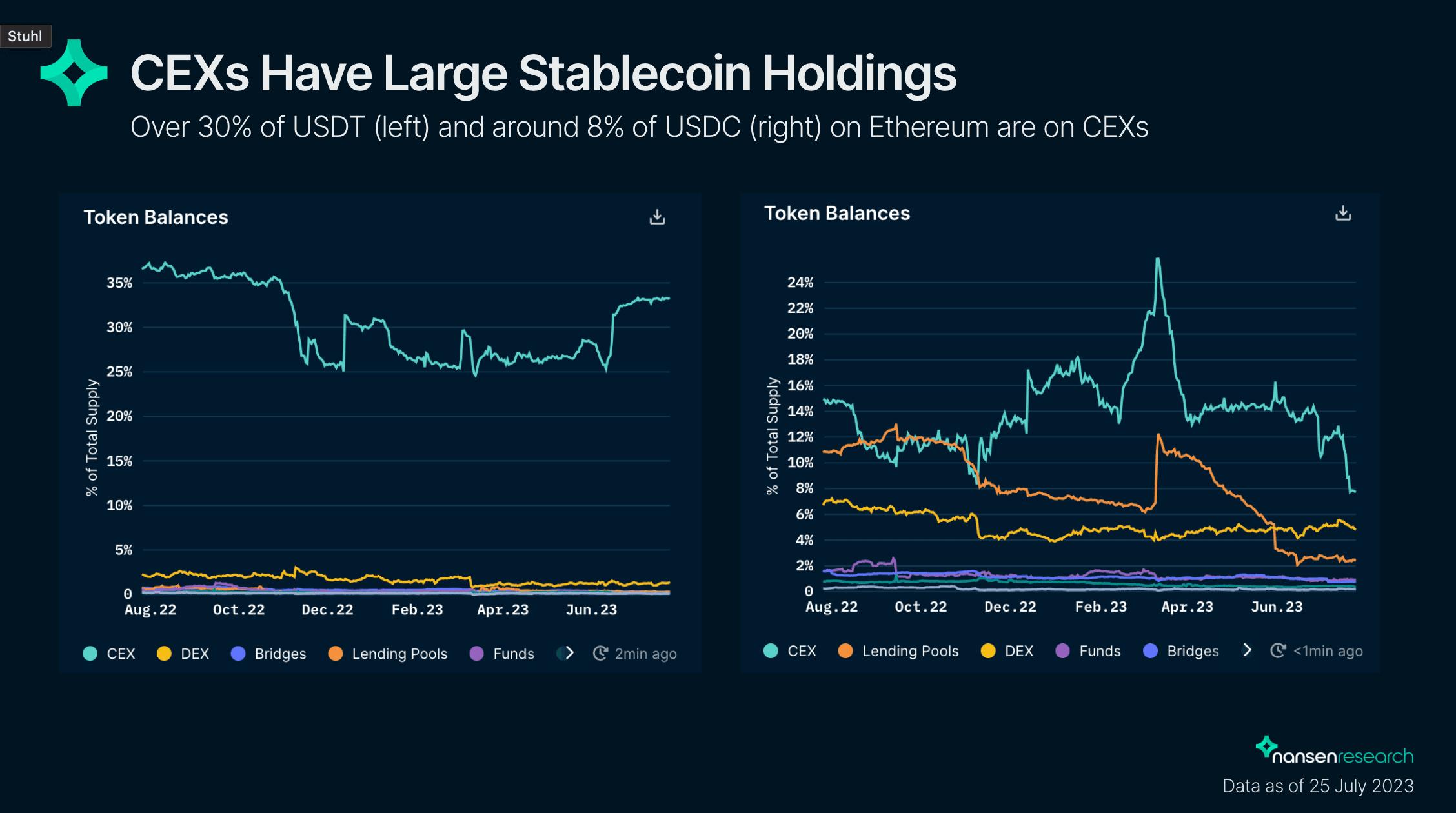
However, this is not a purely institutional indicator as the majority of the largest stablecoin holders and minters are centralized exchanges (holding ~30% of all USDT and ~8% of all USDC on Ethereum), in turn catering to a lot of retail clients.
In the case of CEXs minting stablecoins, a clear separation of the funds’ origin being retail or institutional is harder to make, as this happens behind closed (centralized) doors.
The chart shows ETH price and stablecoin market caps. It can be seen that the two are indeed heavily correlated, especially during the last cycle. Throughout the whole cycle, the stable market cap kept growing, only slowing down on large market movements, until the crash in May 2022 when it decreased substantially for the first time since the onset of the cycle.
Taking a more detailed look at the weekly net changes in stablecoin market caps vs. average ETH price in that week, the cycles seem to be predated by consecutive weeks of noticeable increases in the stablecoin market cap.
Even before the latest rather short rallies in January (price from $1200 to $1600) and the end of April (price from $1600 to $2000) this year, there have been short periods of a consecutive net increase of market cap, with the dip in market cap in March being attributed to the USDC depeg. Currently, there are no very consistent periods of market cap increase over several weeks.
Overall, the weekly net change in USDT and USDC market cap seems to work surprisingly well as an indicator for longer-term positioning (~weeks to months), considering it is such a simple and readily available metric. On shorter timeframes or if not aggregated over several days, however, it seems to perform less well due to high market volatility.
Fresh Retail Wallets
The second metric looks at the onboarding of new retail users to Ethereum. To identify as a new retail user on day X, an address needs to satisfy several criteria:
- First incoming transfer on day X
- Not a smart contract
- Not belonging to a known entity
- Firsts interaction is with a DEX or NFT-related smart contract within 3 days (very unlikely a new retail user would e.g. immediately bridge or know what a bridge is, but instead just directly go to the chain)
- Funded by a centralized exchange with less than $100k worth of ETH
Out of this onboarding process, the report looks at three metrics; the number of onboarded retail users, the absolute USD value, and the absolute ETH value they were funded with. The activity on Ethereum is taken as a representation of the overall crypto market.
The Number of New Retail Users
This metric is closely related to retail adoption, as it purely looks at the wallet count of freshly onboarded retail users as defined previously.
The first major spike of the last cycle was during DeFi summer, when new weekly users increased from around 700 (June 2020) to almost 8,000 at its peak (August 2020), depicting parabolic growth. Even after DeFi summer (October 2020), the onboarding did not revert to previous levels but stayed at around 2,000-3,000 per week. This ongoing increased influx of retail participants during relatively uncertain market conditions indicated a heightened interest in what was happening in crypto and DeFi in general and foreshadowed the bull run (early 2021) that was about to ensue.
There has been a noticeable peak in May 2021, coinciding with a local top of Ethereum prices. Interestingly for the second top in October 2021 which boasted even higher ETH prices, the weekly new users did not reach that height again. However, during most of the second leg of the cycle, new incoming users stayed well above post-DeFi summer levels. Only shortly before the big crash in May 2022, the retail interest subsided and new retail wallets dropped to around 3,000 per week, to the levels after DeFi summer.
Overall, it seems as though during the big bull runs, you can see a parabolic growth of new users. This is likely due to a network effect of friends telling more friends, leading to an avalanche of new retail in a relatively short timeframe, before there is some sort of crash and people get burnt and lose interest for a while.
Interestingly, if after such a pull-back the levels of onboarded users per week remain way above previous lows, chances are that the cycle is not yet concluded. Although there are not too many data points, this occurred in early 2018 as well as mid 2021.
Currently, the number of onboarded users is not parabolic and remains around the levels after DeFi summer (~3,000 per week), hinting that the new bull cycle hasn’t started yet.
Total USD Funding Value of New Retail Wallets
Unlike the previous metric, the total USD funding value of new retail wallets focuses more on the economic side of retail coming into the market than the social or adoption side.
Overall, the chart looks very similar to the chart of the wallet count, albeit more pronounced. Similar patterns can be observed, with parabolic growth in weekly retail money inflow over several weeks marking the beginning of significant uptrends in ETH price. Furthermore, retraction that is still well above the previous lows seems to mark continued retail interest in the crypto market.
Total ETH Funding Value of New Retail Wallets
Funding in ETH takes is very similar to the previous metric, just that it is not depending on the USD price of ETH but uses ETH itself as the denominator, setting the funding amount in relation to the ETH market cap. This can give some insight into how much it can actually “move the needle” further, given that on average the better the market conditions and the higher the market caps, the more additional capital you need to push prices even higher.
It has to be noted though, that this is just an approximating heuristic, for a more accurate picture one has to take into account other metrics, specifically liquidity depth, as well.
The chart draws a similar picture as the previous charts, however, this metric seems to be a bit less lagging. Since it is normalized by ETH price, a new influx of money in ETH is more heavily weighted at lower ETH prices compared to new money influx in USD, and less weighted at high ETH prices, “rounding” the chart noticeably.
ETH influx by retail does not necessarily have to go parabolic to mark the beginning of a bull market, but slightly linear growth coupled with rising ETH prices is sufficient - and significantly easier for the human eye to catch than parabolic growth.
Looking at the chart itself, DeFi summer marks an absolute peak in new ETH inflows by retail, and ETH influx continued to be high during the first leg of the bull market. For the “second half” of the bull market at the end of 2022, retail ETH influx still ranged somewhat stable between 5k-10k ETH per week, despite rising prices, before starting to dwindle towards the end of the cycle.
Currently, most weeks have a 1.5k-3k ETH influx due to retail, with prices mostly ranging. According to this metric, currently, we are not yet experiencing a bull market.
The presented on-chain metrics tracking new money entering the market have historically shown early signs of a beginning bull market when looked at in conjunction with other metrics, especially the price movements of Ethereum.
While stablecoin market cap is a simple metric, it is easily accessible and gives surprisingly good insights into the influx of new money. One major shortcoming is, that this metric is rather generic, and where this money comes from and why it is entering the market is very hard to tell. However, the general approach might also be a strength given it encompasses institutions, exchanges, retail, and professionals.
The newly onboarded users on the other hand provide a more differentiated picture, narrowing down the scope to retail users as much as possible. It manages to capture the level of retail adoption, and can help to spot the onset of a larger cycle when looking at a combination of factors such as ETH influx from retail paired with the ETH price chart.
One thing to note though is that the absolute best time to buy is before new money, especially retail, so all of these metrics will not help find a potential bottom. Rather, they can provide reassurance that a current price spike is the starting point of the next cycle and not just a local top. After this analysis, the current metrics do not suggest a bull run has already started.